You have been redirected from an outdated version of the article.
Below is the content available on this topic. To view the old article click here.
Edit Button
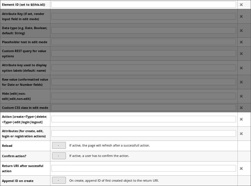
An Edit Button is an Action Button configured to enable the interactive editing mode of a Structr Page when clicked. The edit button must be connected to a set of Dynamic Output Elements which will be replaced by corresponding input fields when the edit action is triggered.
The following fields can be used to configure an edit button.
– | –
Element ID | Refers to the element that is supposed to be edited.
Example: ${feed.id}
Action | The button action, must be edit:<type> for the edit action
Example: edit:DataFeed
Attributes | A comma-separated list of names of Active Input Elements that will be written to the given element.
Example: name,url,updateInterval,maxItems,maxAge
Reload | Whether to reload the page upon successful creation
Confirm | Whether to ask the user for confirmation before executing the action
Return URI | The return URI base if reload above is enabled
Append ID | Whether to append the ID of the newly created object to the return URI above

Search results for "Edit Button"
Remote Widgets
Remote Widgets can be inserted into a page just like local widgets. The only difference is that you can not edit the source code or the tree path, and you see a View button ( ) instead of an Edit button when hovering over the Widget element.
Canvas
Type names of custom types can be changed by clicking on the text of the type node. When hovering over the type node the context icons are made visible. The Edit button ( ) opens the details dialog for the type and the Delete button (
 ) allows deleting the type after a confirmation.
Type Details Dialog
When hovering over the text label of relationship, the context icons are made visible. The Edit button ( ) opens the detail popup for the relationship and the Delete button (
 ) allows deleting the relationship after a confirmation.
Remote Widgets
The Remote Widgets section allows you to select a Widget server from a list of servers, and shows all Widgets that are available on the selected server. Clicking on the Edit button ( ) next to the select box opens the Widget Servers dialog where you can manage the list of remote widget servers.
Local Widgets
Edit File
The edit button opens up a dialog to edit the files content. Additionally to editing the raw text of the file, you are presented with three additional configuration parameters namely: Line Wrapping, Replace <a data-id="c535223d2c1e409ebdcbbfcf1479c15f" class="mention">template</a> expressions and Show preview. The line-wrapping option controls how lines are handled that do not fit onto the page. Either a scroll bar at the bottom is provided to navigate the width of the document, or long lines are automatically wrapped at the end border of the dialog box.